Best Infographics About Cars
There is a huge hype around data visualizations nowadays, the ability to explore data in a beautiful way is very appealing and helping everyone understands data better.
I am personally a big fan of data viz and when it comes to data visualizations and infographics about cars and motors it’s even better!
Here at Auto Carb we decided to compile a list of some of the best graphics the web has to offer.
We made sure to collect a wide range of visualizations, there are regular graphics but also motion ones ( Video graphics) and interactive visualizations when you can actually interact with them on the fly and see the data changes accordingly, Enjoy!
World’s Most Popular Cars by Country

The Life in the Fast line

Used Car Prices During the Recession

Europe’s Deadliest Driving Countries

The World’s biggest car collectors and their fleets

Where was my car built?

The Little Things Add Up: The True Cost of Owning a Car

Europe’s Biggest Car Buyers of 2012

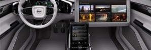
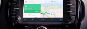
Digital Technology in Your Car

The Evolution of the F1 Car
2011 Car Buying Trends

Marlboro Car Projection Mapping
Marlboro Car Projection Mapping
Petrol vs Diesel: Which is More Cost-Effective
Petrol vs Diesel: Which is More Cost-Effective

How to Buy a Used Car

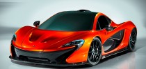
The World’s Most expensive Cars

Misunderstood Road Signs and Confused Motorists

The Greener Way To Get There
The Greener Way To Get There

 Best Performance Driving Schools in the World
 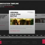 Nissan Presents – Time’s Greatest Innovations
 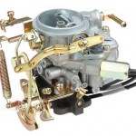 What Is A Car Carburetor?
  How not to Move Stuff With Your Car